News Summary
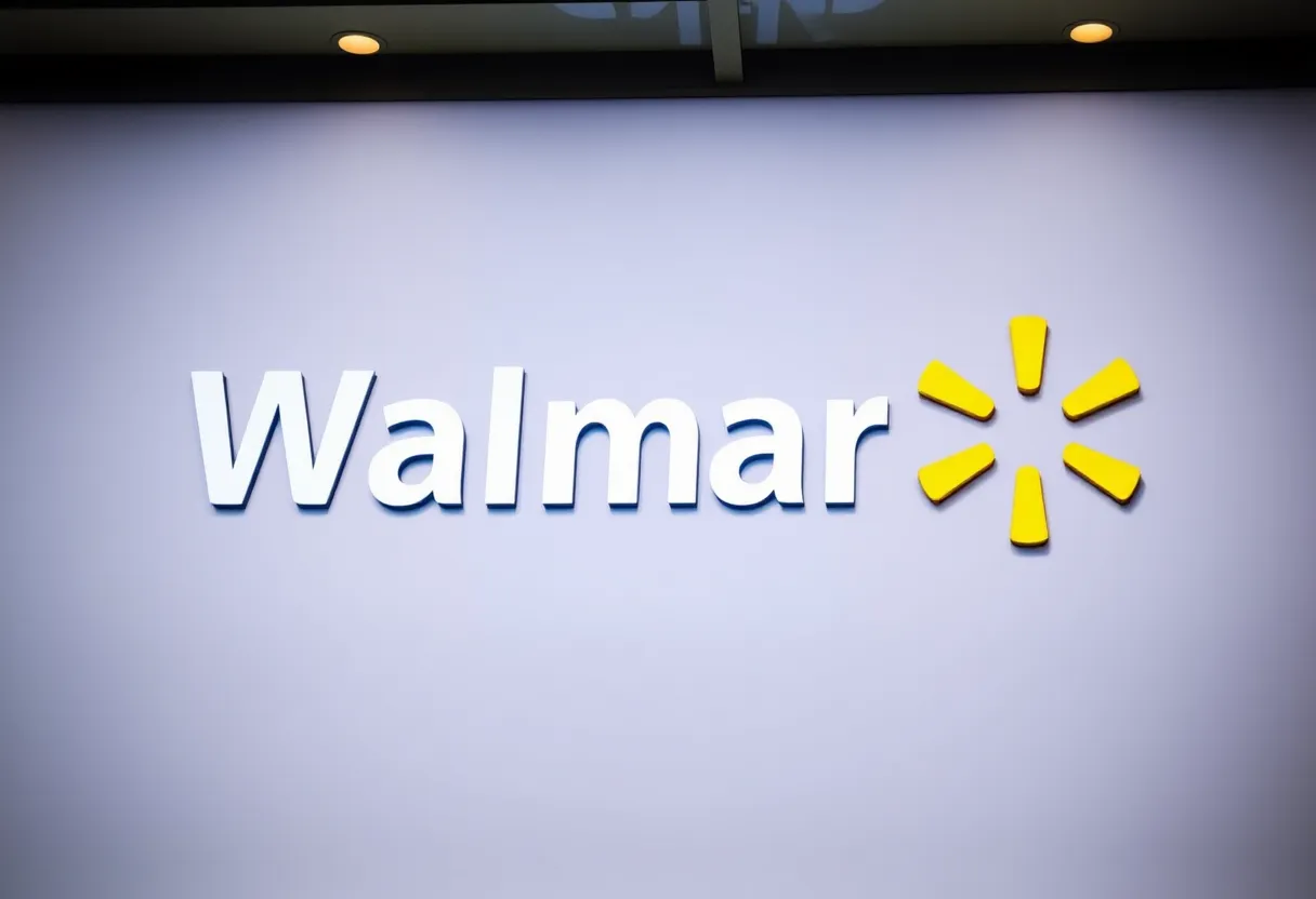
Walmart has revealed a fresh brand identity, introducing a new logo for the first time in nearly two decades. This redesign includes a modern wordmark inspired by Sam Walton’s trucker hat, a dynamic spark logo, and updated color schemes. While Walmart aims to evolve with customer expectations, public reactions are mixed, with some applauding the aesthetics and others feeling skeptical about the necessity of change. The logo rollouts will commence in January 2025 across platforms.
Walmart Unveils New Logo After Nearly 20 Years!
Hey there, folks! Big news coming out of Walmart this week as they’ve decided to refresh their brand identity for the first time in almost two decades! On Monday, the retail giant introduced a comprehensive brand refresh, aimed at showing how they’ve evolved into what they proudly call a “people-led, tech-powered omnichannel retailer.” The updates really speak to Walmart’s drive to keep pace with how shoppers see them today.
What’s New with the Branding?
So, let’s dive into what exactly has changed. The most visible alteration is the new wordmark, which takes its inspiration from founder Sam Walton’s iconic trucker hat. This wordmark is now sporting a fresh, modern font that helps set it apart from other retailers. The idea here is to create something that’s not just visually appealing but also distinctly Walmart.
Alongside the wordmark, there’s a newly designed “spark” logo that is intended to embody the energy and dynamism that Walmart wishes to project. If you’ve been to a store recently, you might notice the color scheme has remained true to its roots with familiar shades of blue, but there are a few modern updates that add a touch of freshness.
When Can We Expect the Changes?
As for when you can see these changes in action, Walmart plans to roll out the refreshed branding across various platforms—think their website, mobile app, and physical stores—beginning in January 2025. They kicked off some of the updates back in October 2024, with the remaining store redesigns happening gradually over time.
How Does This Compare to Previous Changes?
This logo transformation is particularly notable since it’s the first swap since 2008, when Walmart transitioned from the hyphenated “Wal-Mart” to the streamlined “Walmart.” It’s all about looking ahead while keeping a nod to the past, and this is a core principle that Walmart’s Chief Marketing Officer, William White, emphasizes. He mentioned that this redesign reflects their ongoing commitment to evolve with customer needs while respecting the foundation laid down by Mr. Walton.
Public Reaction: Mixed Feelings
Interestingly, the changes in the logo focus on improved spacing, brighter colors, and more rounded edges compared to what was used before. It’s a subtle evolution rather than a radical departure, which might explain the mixed reviews.
Walmart’s Ongoing Growth
For context, Walmart is no small player in the retail world. With over 4,600 stores in the U.S. and about 1.6 million employees (not counting around 599 Sam’s Club locations), they’re constantly working on enhancing their digital-first services. This includes their notable drone delivery operation, demonstrating their commitment to technology and efficiency.
As we move forward, it’ll be intriguing to see how this updated branding plays out in stores and online, and whether the public warms up to it as the rollout progresses. Change can be tough, but it seems Walmart is eager to show that they’re ready for the modern retail landscape!
Deeper Dive: News & Info About This Topic
HERE Resources
Walmart Makes Big Changes with New Brand Update
Additional Resources
- FOX Business
- Wikipedia: Walmart
- USA Today
- Google Search: Walmart brand refresh logo
- Dezeen
- Google Scholar: Walmart logo redesign
- Encyclopedia Britannica: Walmart


